I've decided to use photoshop for a while to edit my photos and in hopes that it will help me change up my editing.
I'll be going through the edits and my process for the past photos I've posted. The biggest difference for me is that Photoshop has layers. I use camera RAW to make the image flat, it's easier to start with if the lighting is flat and the color neutral. The first thing I do is local adjustments and skin cleaning. These are done using an overlay layer and coloring in black and white in the areas I am trying to fix. I use a drawing tablet for the cleaning, since it is much easier to use than clicking with a mouse, pressure sensitivity helps a lot.
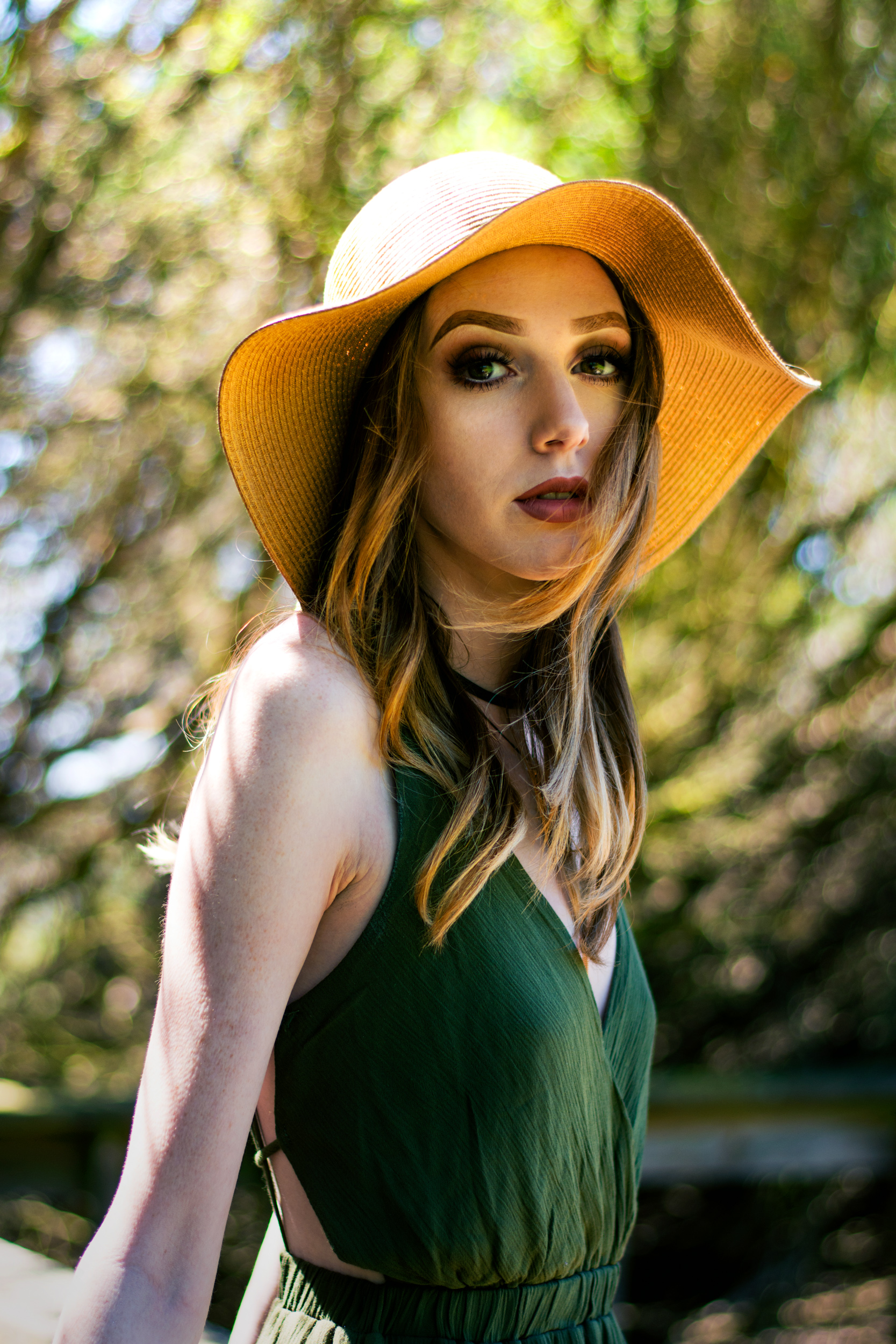
For this one(above), I started by adding some more light coming in from the left. For the color, I focused on the greens and yellows. As most people might find, they are difficult to edit because they are right next to each other and overlap in some spots. I used two different color adjustment layers with layer masks to adjust each individually and in the spots I needed. Then finished off with a curve tone layer and exposure layer.
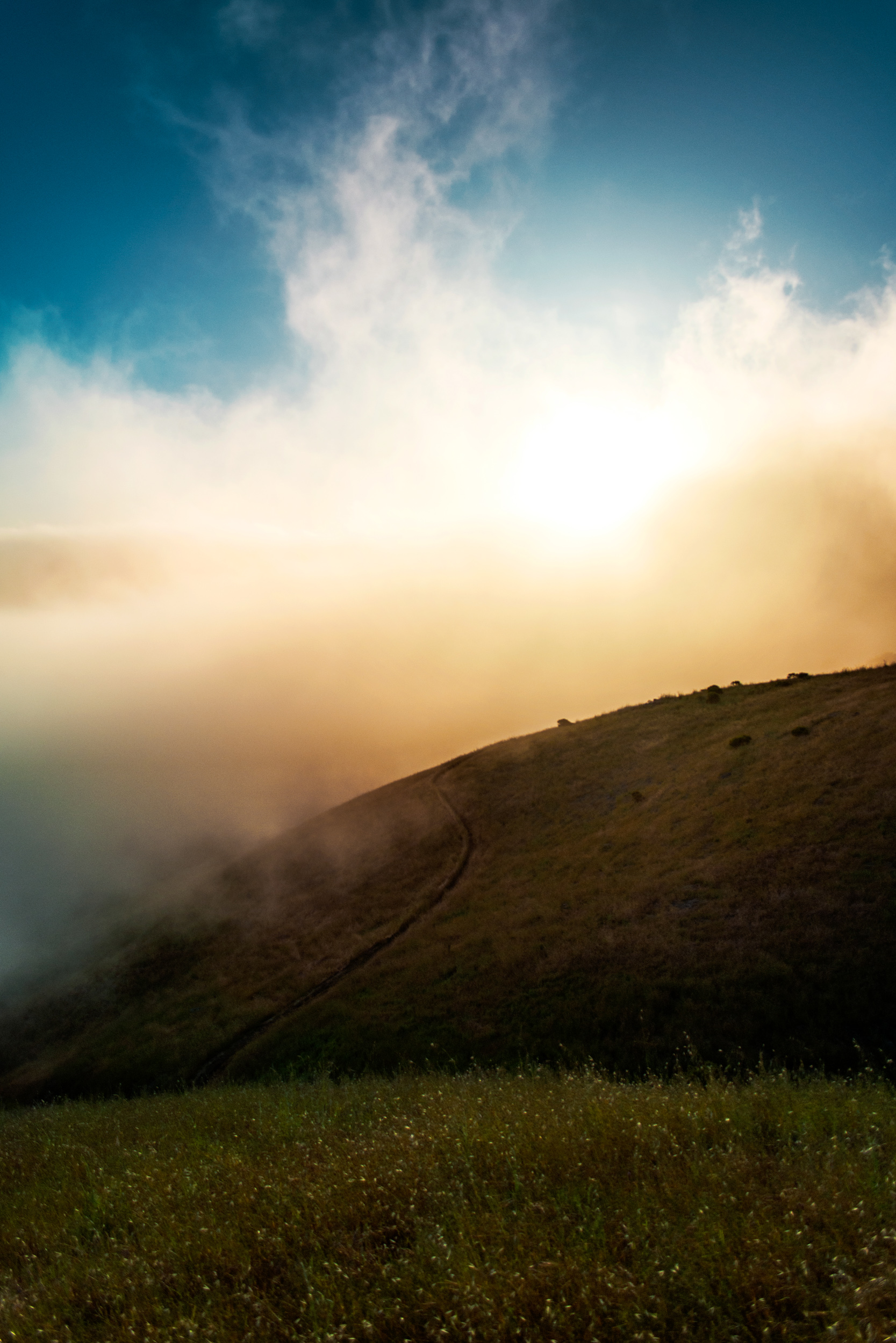
This one wasn't much different. In addition to the color layers, I used a gradient to add a bit more pop to the sun. Photoshop layer types allowed me to change the way the layer affects the image. I've found that screen works the best because it also adds some haze, like the sun would.
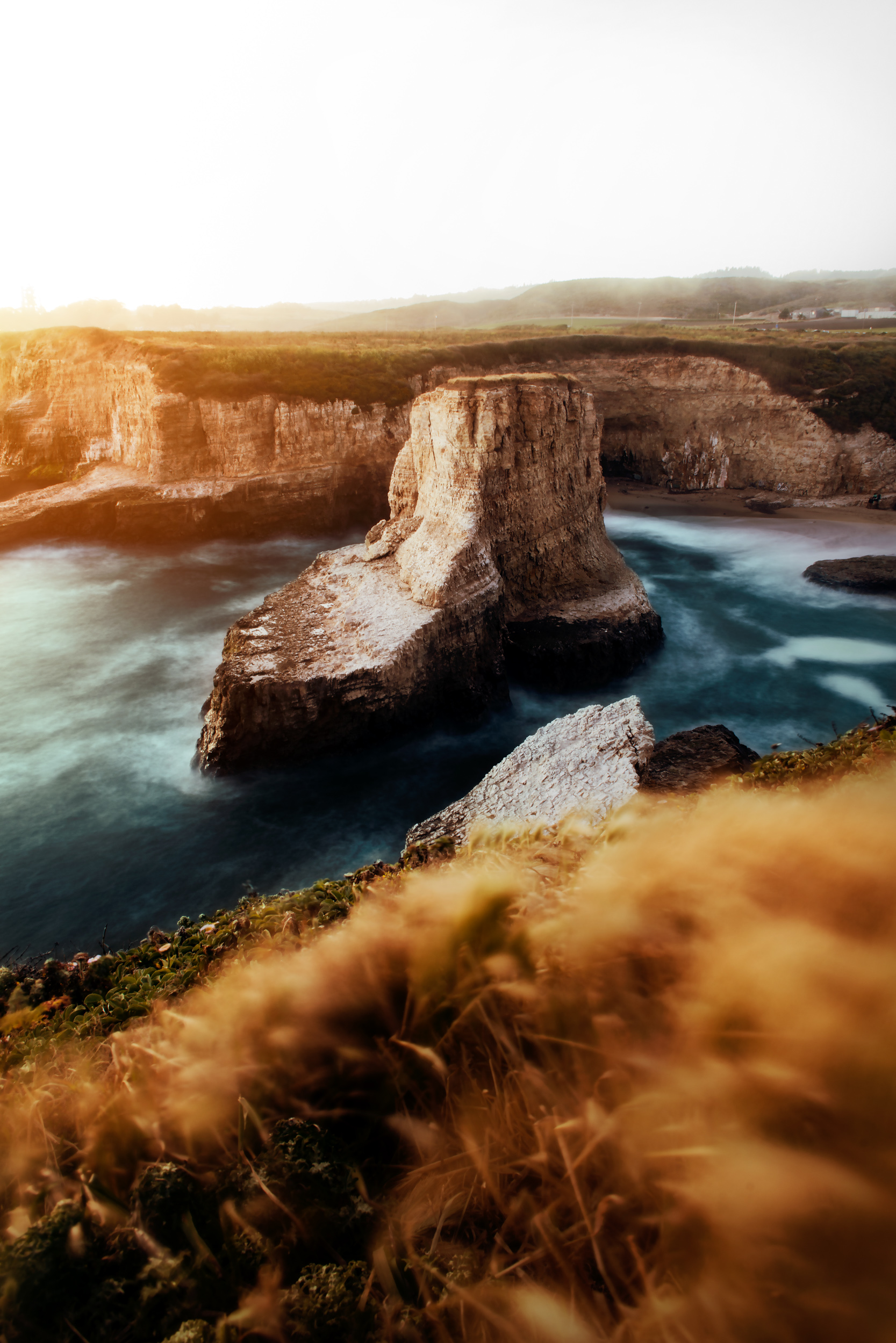
The photo above and below use one of my favorite types of adjustment layers, gradient map. They're pretty simple to understand, and I'll make a blog explaining them more in depth in the future. Basically, they map the photo from blacks to whites based off of the color scale you choose. In the photo above I used two gradients, one warm and the other cool for the cliff and water. The warm one gave it a golden hour type look, while the blue kept the water cool. Neither were at 100% opacity because that would make it monotone and unrealistic. The one below has a single gradient on it. It added contrast and color to the image. By changing it to overly type, it also sharpened the photo a bit.
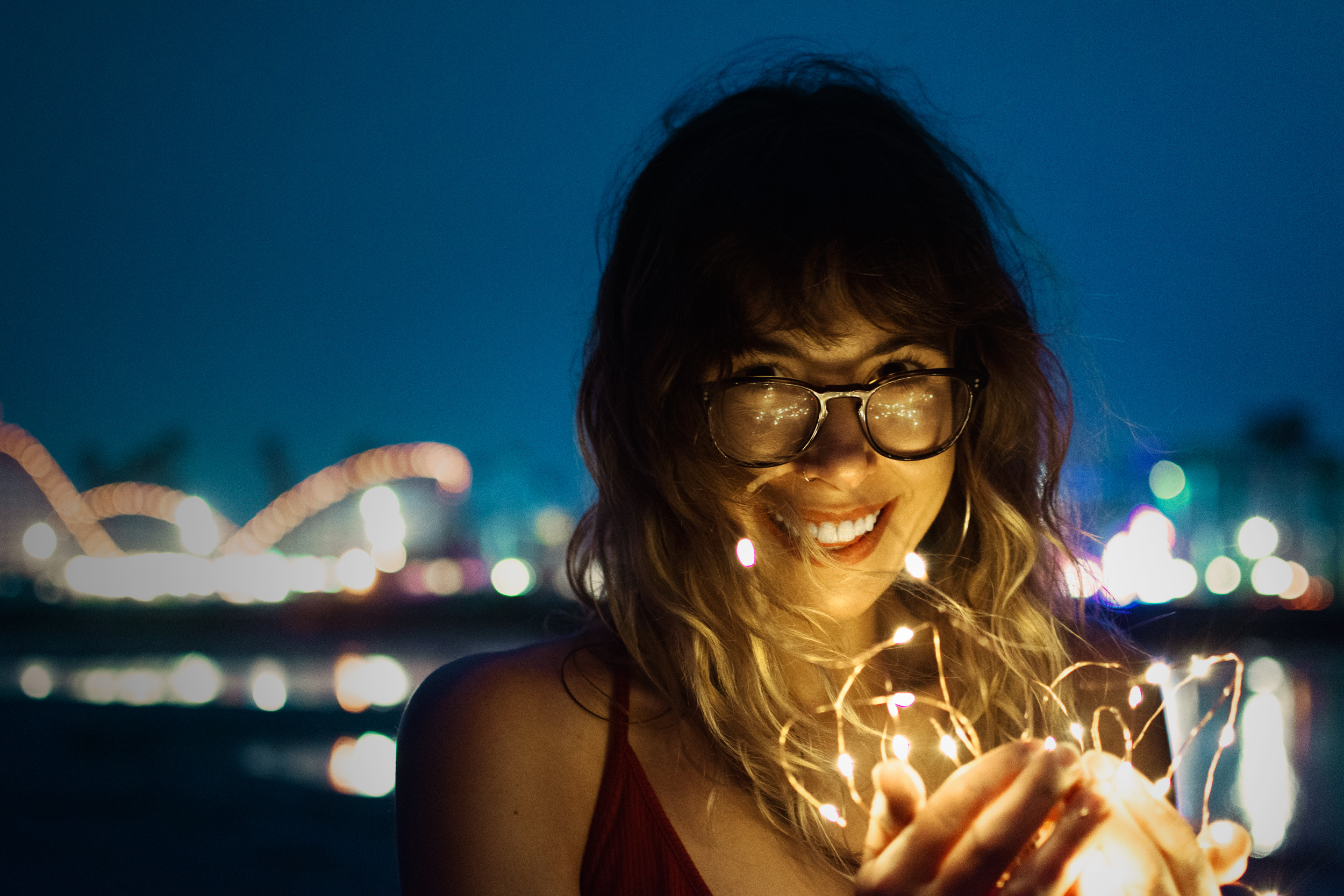
For the one above, I used a single gradient to bring out the warm tones from the light strings. Then, I added a couple of overlay layers to bring out the glow from the lights and to add a vignette to the background.
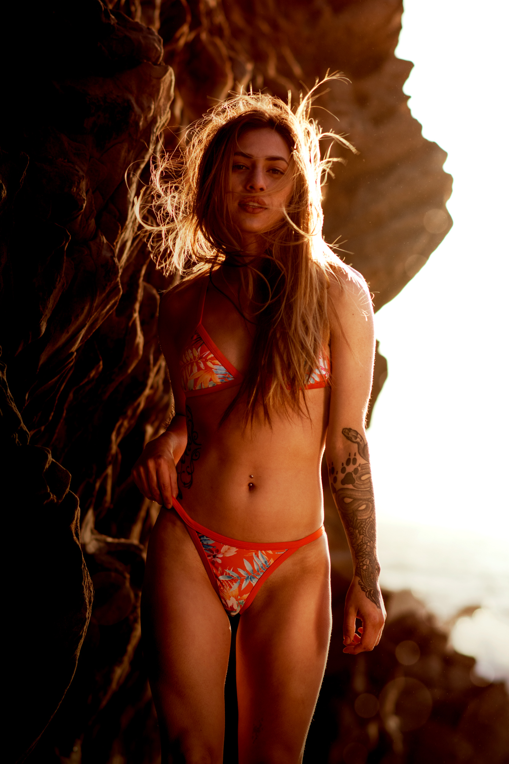
The photo above may look simple, but it uses almost all the tricks I've mentioned. In addition I added some bokeh. I don't like the two large ones on the bottom right, so Ill remove them later.
